PowaPad 預熱推廣活動
PowaPad Pre-Launch Campaign
簡介 Introduction
設計問題 Problems
PowaPad 是一款設計簡約時尚的磁吸式無線手機充電器,將以全新品牌 POWA 於眾籌平台登場。這項預熱推廣計劃可以測試市場需求,提升關注度及完善品牌定位,為日後正式眾籌建立更高的轉化率。其中的重點包括:建立電郵名單、推出 US$1 的早鳥預留活動,以及進行視覺與文字訊息的 A/B 測試,找出最具吸引力的創意方案。
PowaPad is a sleek, magnetic wireless charger for smartphones, set to launch on a crowdfunding platform under the new brand POWA. This pre-launch campaign was conducted to validate demand, generate early excitement, refine brand positioning, and pave the way for higher conversion rates during the upcoming crowdfunding launch. It focuses on building an email list, securing early US$1 reservations, and conducting A/B testing on art direction and messaging to identify the most effective creative approach.

解決方案 Solutions
方法 Methods
研究 Research
根據 AIDA Model,Marketing Funnel 展示了我們如何吸引目標客群,並將其轉化為早期支持者。首先推出一系列 Facebook 廣告,提高品牌在目標受眾中的認知度,再引流至登記網頁。網頁清楚呈現 PowaPad 的核心功能,鼓勵用戶訂閱以獲取最新資訊。用戶提交電郵地址後會收到歡迎電郵,並被引導前往 US$1 早鳥預留網頁。點擊 「立即預留」 按鈕即可進入結帳網頁。完成付款後,會彈出確認頁面。留下手機號碼,即可以接收後續更新及專屬優惠。
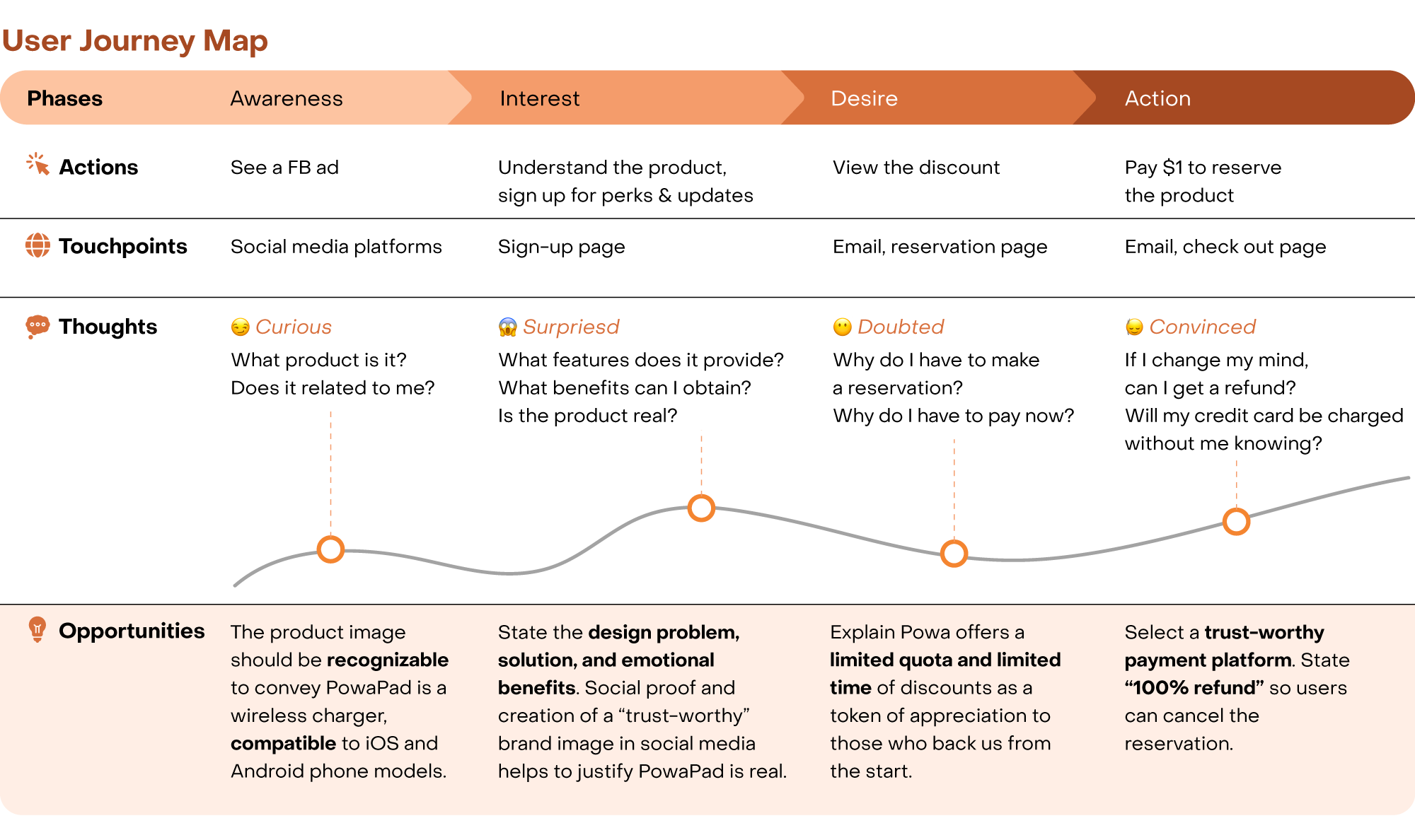
為確保預留產品的流程順暢,我們製作了 User Journey Map,以識別潛在盲點,解決可能影響轉化率的障礙。
Bases on the AIDA Model, the Marketing Funnel illustrates how we attracted and converted the target audience into early supporters. First, a series of Facebook ads were launched to raise brand awareness and drive traffic to the sign-up page. The page clearly showcased PowaPad’s key features, encouraging visitors to subscribe for the latest updates. After submitting an email address, the user received a welcome email directing them to the US$1 early-bird reservation page. Clicking “Reserve Now” led to the checkout page, where payment was completed. A confirmation page then appeared, prompting entry of a mobile number to receive future information and exclusive promotions.
To ensure a seamless path toward the ultimate goal — completing a reservation — a User Journey Map was created to identify potential blind spots and address obstacles that might hinder conversion.

藝術指導 Art Direction
簡介 Introduction
簡介 Introduction
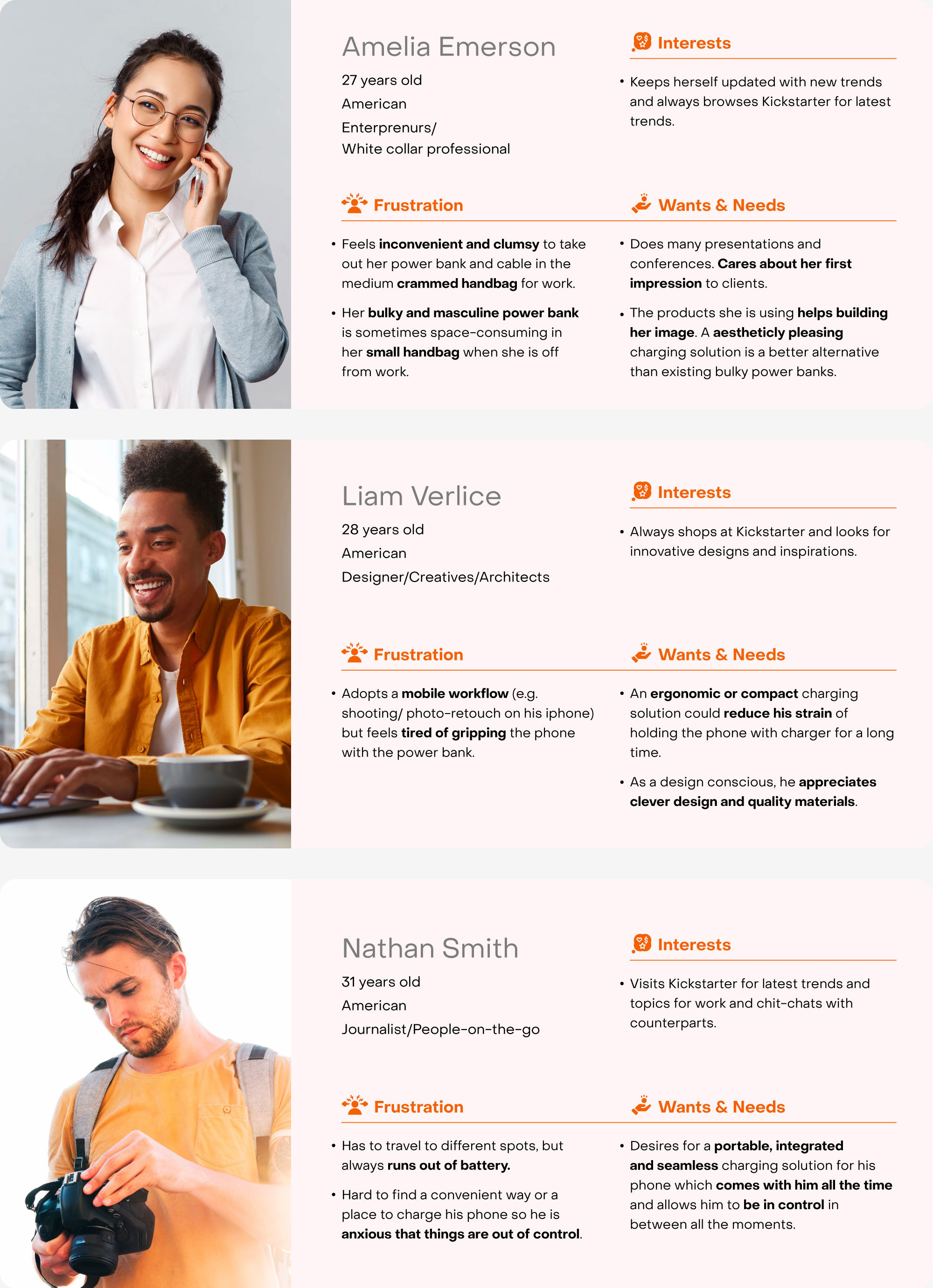
Persona 有助界定潛在客戶及 Facebook 廣告的目標受眾,並啟發不同的行銷文案方向。從以上三個 Personas 可見,受眾最重視的產品特點分別為:設計美學、便攜性,以及能保持生活節奏不中斷的充電體驗。
Personas help define potential customers and target audiences for Facebook ads, inspiring diverse marketing messages. Insights from the three personas reveal that audiences place the highest value on three key product strengths: aesthetic design, portability, and a seamless charging experience that keeps life moving without interruption.
設計美學|Design Aesthetic
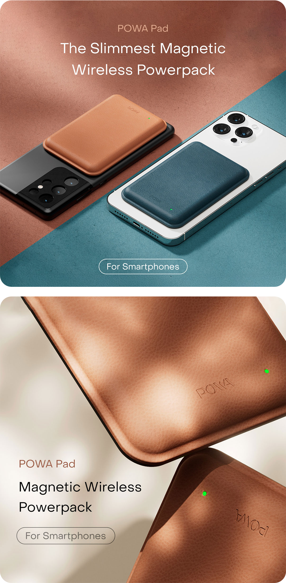
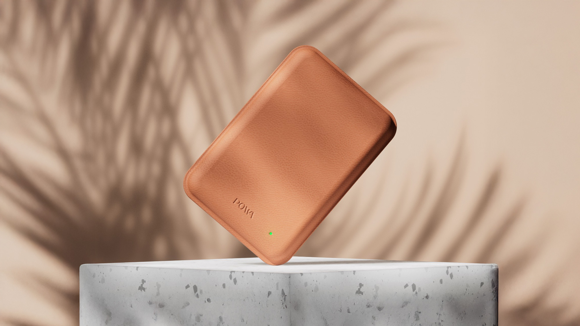
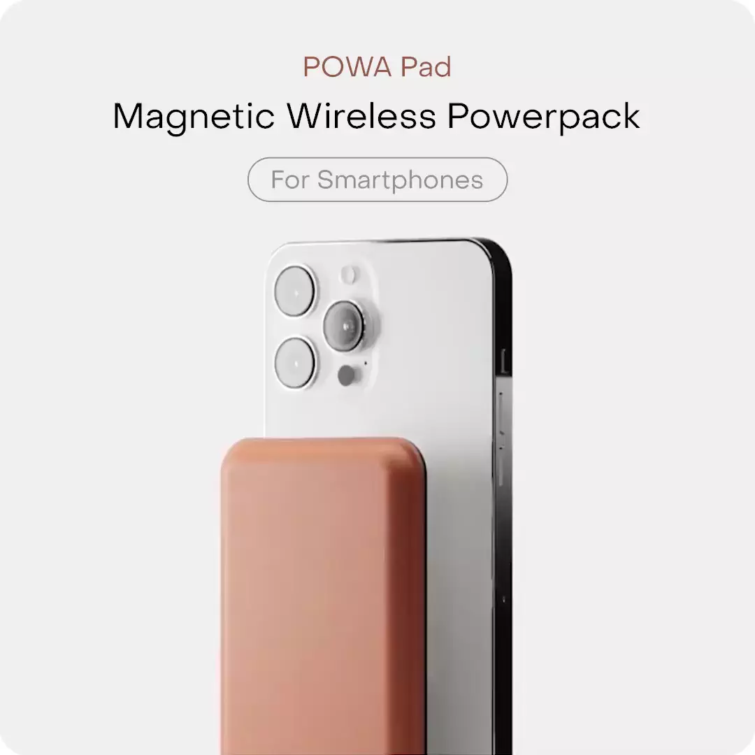
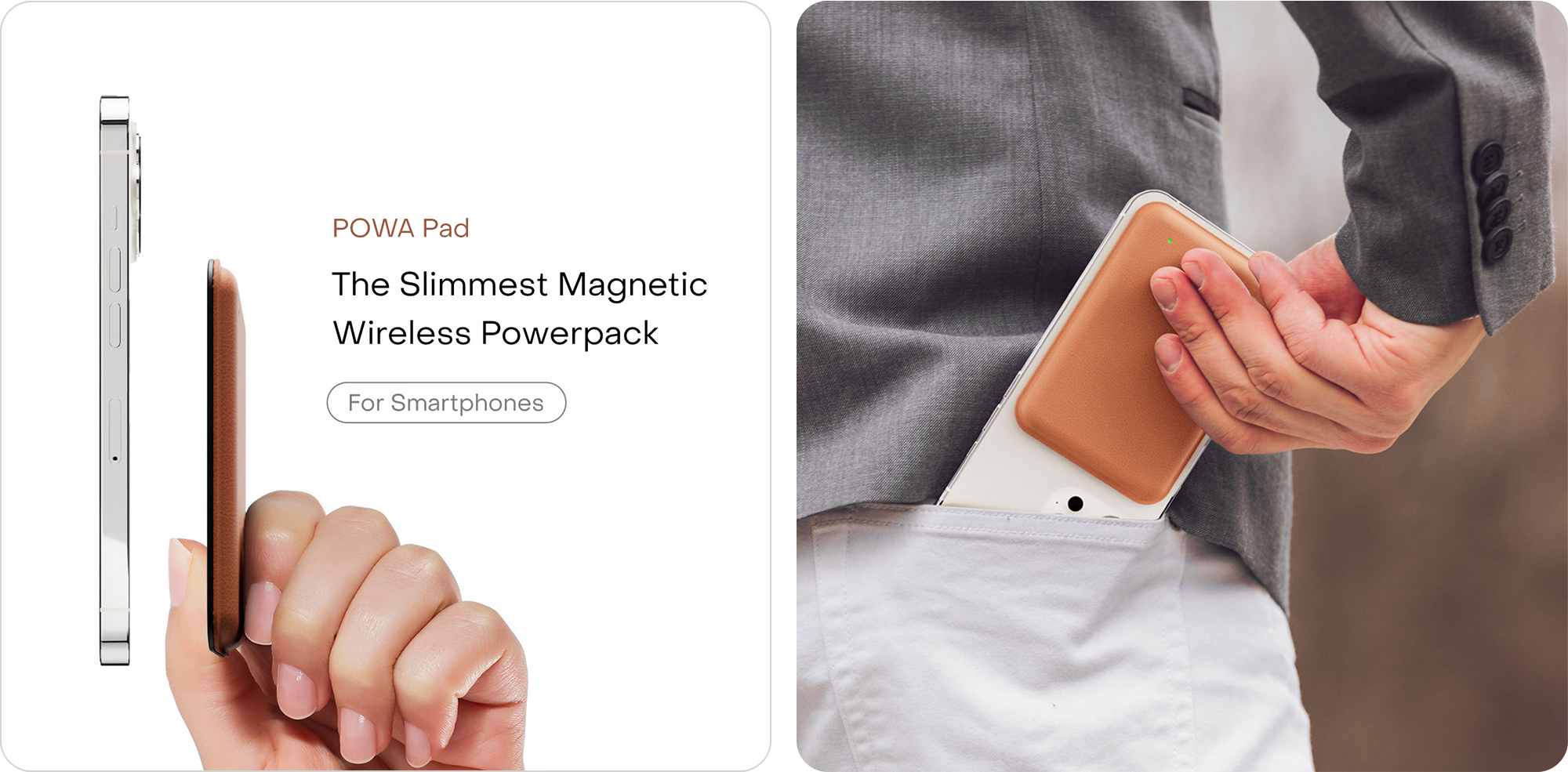
PowaPad 流暢的磁吸設計能完美融入各款智能手機。其無線、纖薄的外型,為你的隨身生活增添一份時尚氣息。
PowaPad’s sleek and magnetic design seamlessly integrates into any smartphones. Its wireless and compact form adds a touch of visual elegance to your on-the-go lifestyle.
便攜度|Portability
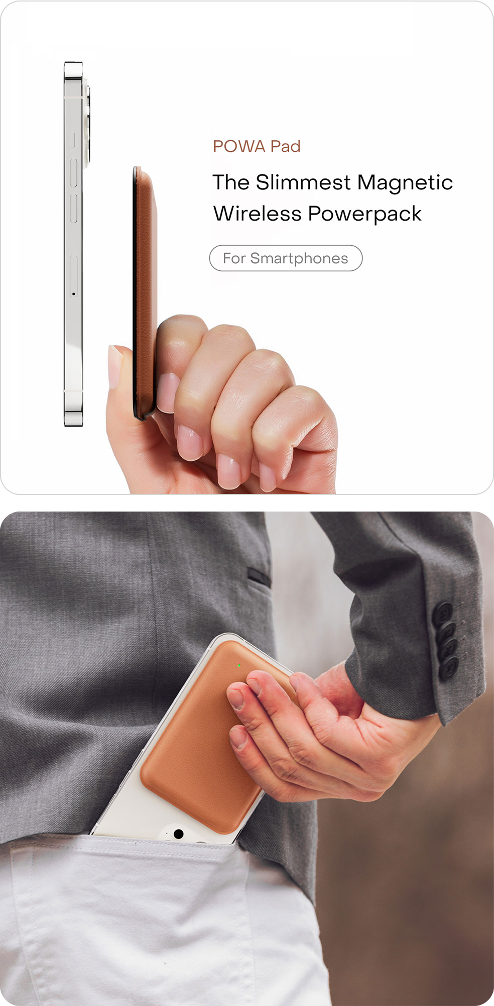
PowaPad 輕薄小巧,能輕鬆放進口袋,方便隨身攜帶。其符合人體工學的設計,握在手中舒適無比。
PowaPad is lightweight and compact, easily slipping into your pocket for effortless portability. Its ergonomic design ensures a comfortable grip in your hand.
充電體驗|Charging Experience
邊充電邊使用裝置,保持生活節奏不間斷,自在掌控每個時刻。
Use your device while charging — keep your life flowing without interruption and stay in control every moment.
設計美學|Design Aesthetic
PowaPad 流暢的磁吸設計能完美融入各款智能手機。其無線、纖薄的外型,為你的隨身生活增添一份時尚氣息。
PowaPad’s sleek and magnetic design seamlessly integrates into any smartphones. Its wireless and compact form adds a touch of visual elegance to your on-the-go lifestyle.
便攜度|Portability
PowaPad 輕薄小巧,能輕鬆放進口袋,方便隨身攜帶。其符合人體工學的設計,握在手中舒適無比。
PowaPad is lightweight and compact, easily slipping into your pocket for effortless portability. Its ergonomic design ensures a comfortable grip in your hand.
充電體驗|Charging Experience
邊充電邊使用裝置,保持生活節奏不間斷,自在掌控每個時刻。
Use your device while charging — keep your life flowing without interruption and stay in control every moment.
設計美學|Design Aesthetic
PowaPad 流暢的磁吸設計能完美融入各款智能手機。其無線、纖薄的外型,為你的隨身生活增添一份時尚氣息。
PowaPad’s sleek and magnetic design seamlessly integrates into any smartphones.
Its wireless and compact form adds a touch of visual elegance to your on-the-go lifestyle.
便攜度|Portability
PowaPad 輕薄小巧,能輕鬆放進口袋,方便隨身攜帶。其符合人體工學的設計,握在手中舒適無比。
PowaPad is lightweight and compact, easily slipping into your pocket for effortless portability.
Its ergonomic design ensures a comfortable grip in your hand.
充電體驗|Charging Experience
邊充電邊使用裝置,保持生活節奏不間斷,自在掌控每個時刻。
Use your device while charging — keep your life flowing without interruption and
stay in control every moment.
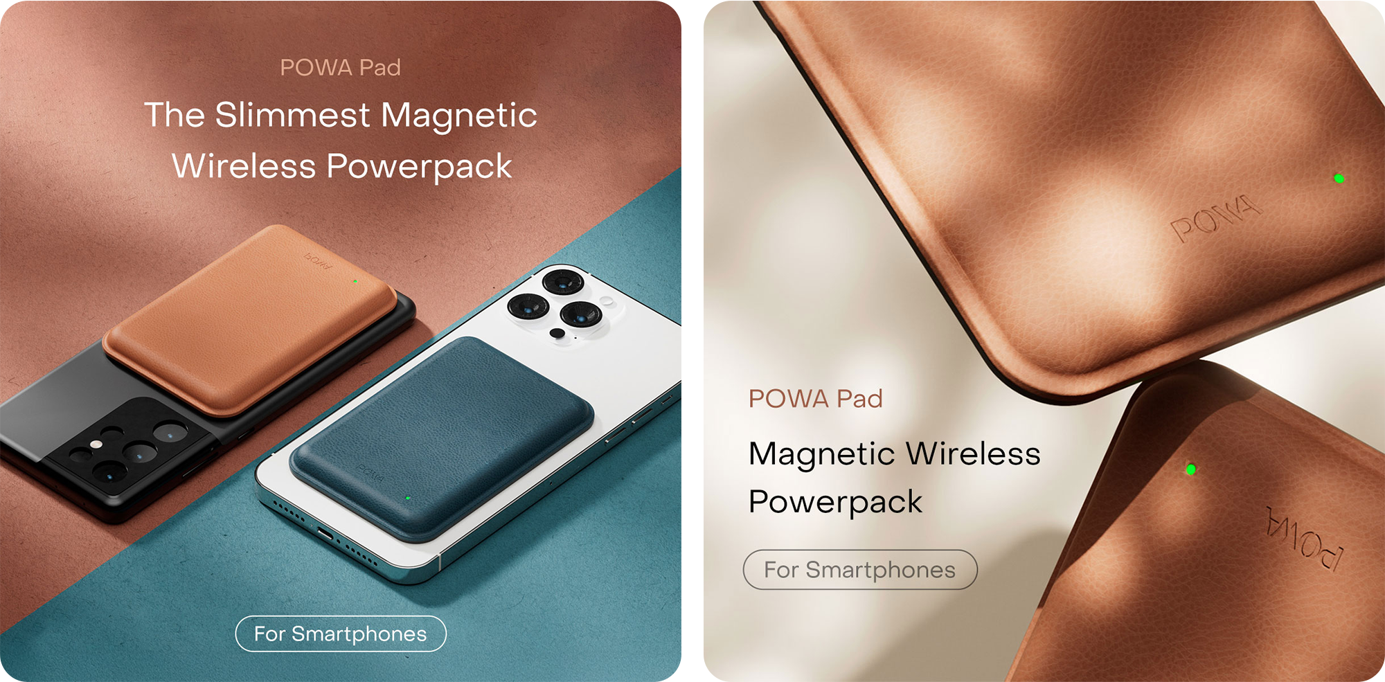
藝術指導 A/B 測試|Art Direction A/B Testing
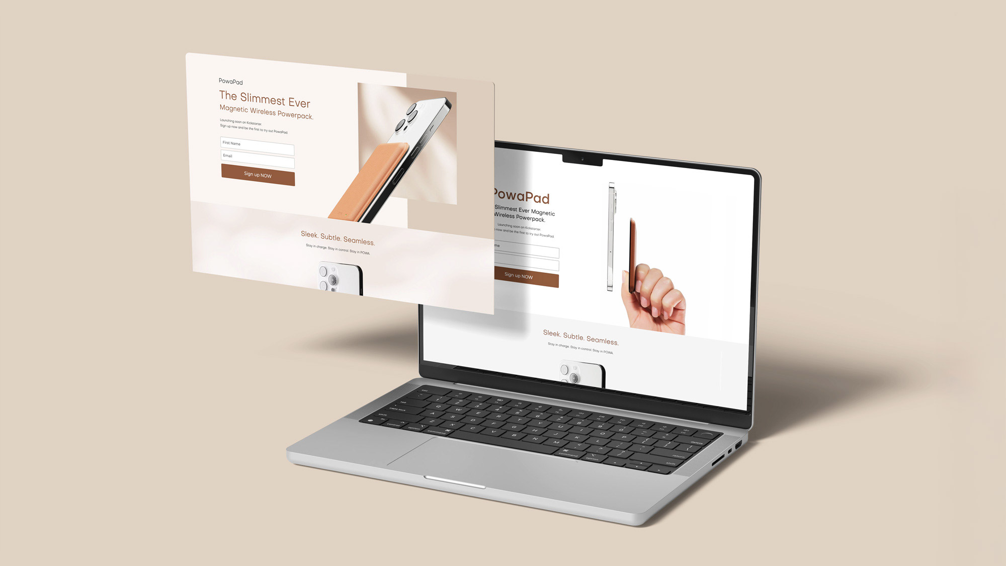
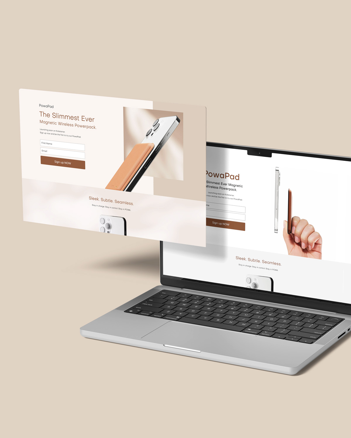
點擊 Facebook 廣告的用戶會被導向登記頁。為了解哪一種視覺設計更能吸引目標受眾,
登記頁設有兩個版本作 A/B 測試。
第一個版本以白色佈局為主,展現現代簡約風格;第二個版本則以暖米褐色為主調,
配合陽光與陰影的畫面,帶出更有氣氛和感染力的視覺體驗。
Users who clicked on the Facebook ads were redirected to one of
two versions of the sign-up page, created for an A/B test
to identify which visual approach resonated more with the target audience.
The first featured a white layout that conveyed a sense of modern minimalism,
while the second used a warm tan palette with sunlight and shadow imagery to
evoke a more atmospheric, moody feel.
成品 Results
結果 Results
經過研究及測試,我們得出以下策略見解:
在不同階段,可以需採用不同的視覺策略
在 Facebook 廣告表現上,動畫及色彩鮮艷的廣告明顯優於純白背景圖像,帶來更高的點擊率;然而在登記網頁的 A/B 測試中,情況則完全相反——乾淨白色的版面有更高的轉換。這反映出社交平台廣告以「吸睛」為首要任務,須在第一時間抓住用戶注意力;至於需要用戶輸入個人資料的登記頁面,則以建立專業與信賴感為優先。
降低認知門檻
清楚展示手機正面與 PowaPad 一同使用的廣告,點擊率較高。可見由於首次接觸 PowaPad 的用戶對產品形態未必熟悉,因此廣告必須具備高識別度,讓人即時明白「這是一款磁吸無線充電器」,才能提升點擊意願。
CTA 按鈕設計對轉換率有直接影響
按鈕的尺寸與顏色是影響轉換的關鍵。測試顯示,按鈕越大、顏色飽和度與對比越高,用戶點擊的意願越強。
Based on research and testing, we have identified the following strategic insights:
Different Visual Strategies for Different Stages
Facebook ads with animation and colorful visuals performed significantly better than static ads with plain white backgrounds, delivering higher CTR. However, A/B tests on the sign-up page revealed the opposite: clean, white-based layouts gained superior conversion. This highlights social media ads prioritize instant attention-grabbing to stop the scroll within the first second. Sign-up pages, where users are required to submit personal information, perform best when conveying professionalism and trustworthiness.
Reducing Cognitive Load
Ads that clearly depict the phone’s front face while magnetically attached to PowaPad achieved better CTR. This indicates that most first-time viewers are unfamiliar with the product form factor. To drive clicks effectively, the creative must deliver instant recognition — enabling users to understand immediately that “this is a magnetic wireless charger”.
CTA Button Design Has a Direct Impact on Conversion
The size and color of the CTA button are key factors influencing conversion performance. Testing showed that larger buttons with higher color saturation and stronger contrast significantly increased users’ willingness to click.