eSAT
簡介 Introduction
設計問題 Problems
eSAT 提供雲端衛星數據處理與分析服務,希望幫助政府和企業用戶監測城市安全和資源狀況。因此,eSAT 需要獨特且現代化的視覺形象,以建立公司聲譽,並吸引潛在投資者。
eSAT provided cloud-based satellite data processing and analysis services, aiming to help government and enterprise users monitor urban safety and resource conditions. Consequently, eSAT required a distinctive and modern visual identity to build its reputation and attract potential investors.
解決方案 Solutions
方法 Methods
研究 Research
市場上其他競爭者的 Logo 及品牌形象都比較傳統。為了營造 eSAT 創新的品牌定位,我們重新設計了風格與別不同的 Logo 及投資簡報,以簡約摩登的設計,表達複雜的科技概念,提高 eSAT 的品牌識別度。
The logos and brand identities of other competitors in the market were relatively traditional. To build eSAT’s innovative brand character, we redesigned its logo and investment pitch deck with a unique style. Through a minimalist and modern approach, the design communicates complex technological concepts while strengthening eSAT’s brand recognition.


藝術指導 Art Direction
簡介 Introduction
簡介 Introduction
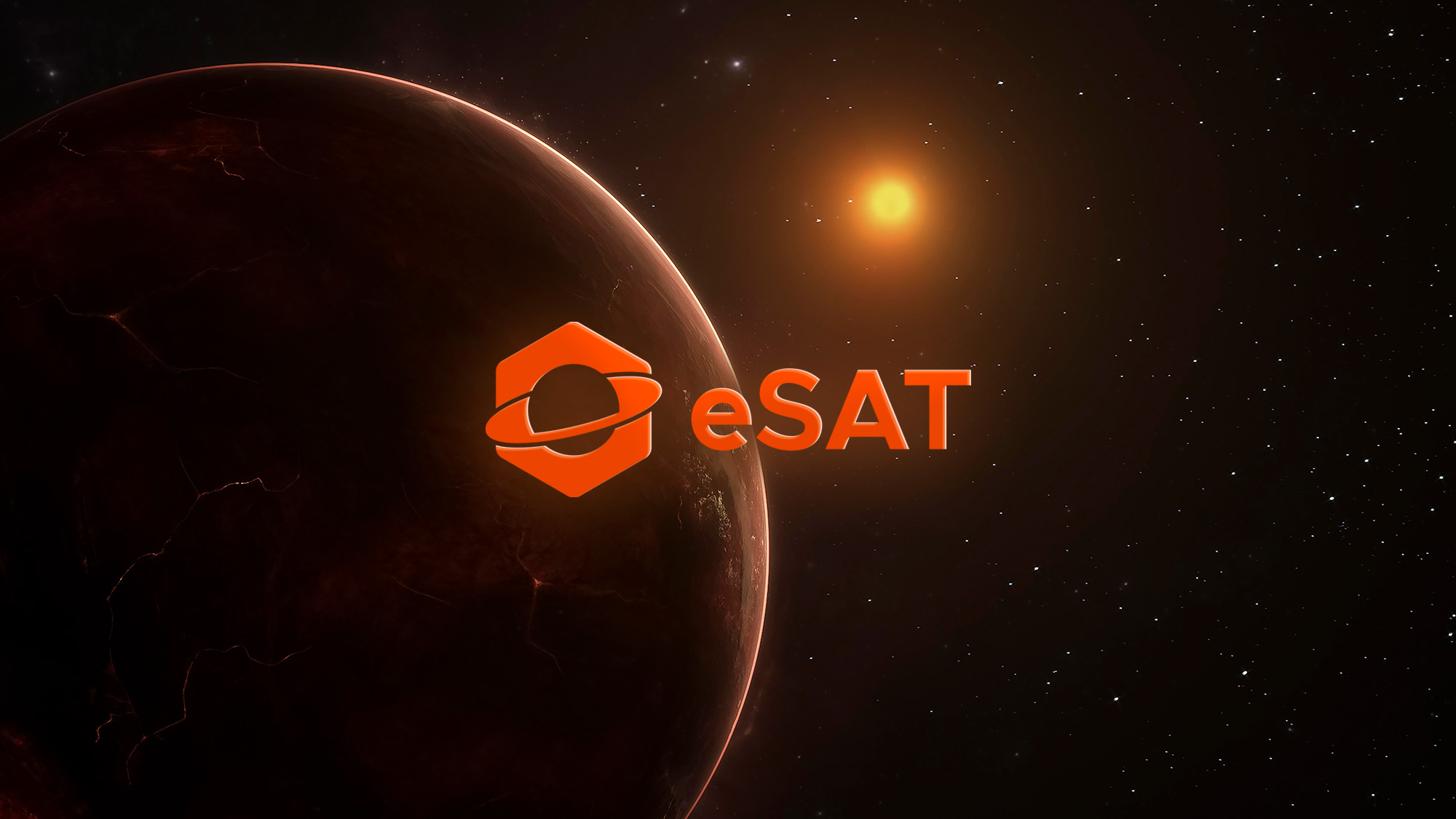
eSAT 原本的 Logo 較為抽象,難以表達出公司的業務,因此我們採用了更具體的設計手法。顏色方面,主色按 eSAT 的偏好選用如太陽般熾熱的橙色和黃色,象徵其對衛星科技的熱情。
eSAT’s original logo was rather abstract and did not clearly communicate its services. Therefore, we adopt a more figurative approach. For the color palette, based on eSAT’s preference, we choose vibrant orange and yellow, evoking the radiance of the sun, to reflect eSAT’s passion for satellite technology.

成品 Results
結果 Results
六角形的形狀代表了 eSAT 衛星分析的六大優勢:全天時、全天候、大範圍、微米級、高密度和成本低。
The hexagonal shape indicates the six key advantages of eSAT’s satellite analysis: all-time, all-weather, wide-coverage, micron-level precision, high density, and cost efficiency.


Logo 結合正負空間設計:負空間呈現一個衛星軌道,凸顯其核心業務;正空間則構成一個六角螺絲,因為在工程中,螺絲通常被視為確保結構穩定與安全的基礎元件,正如 eSAT 在城市安全中擔任的重要角色。
The logo design integrates positive and negative space. The negative space depicts a satellite orbit, highlighting eSAT’s core business, while the positive space forms a hexagonal screw because in engineering, screws are regarded as fundamental elements that ensure structural stability and safety — just as eSAT plays an essential role in urban security.
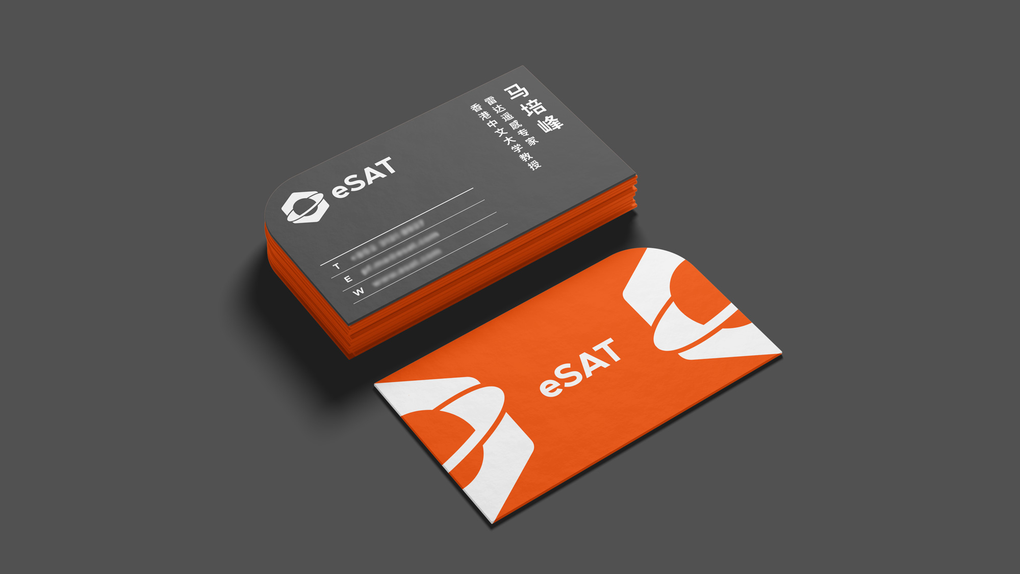
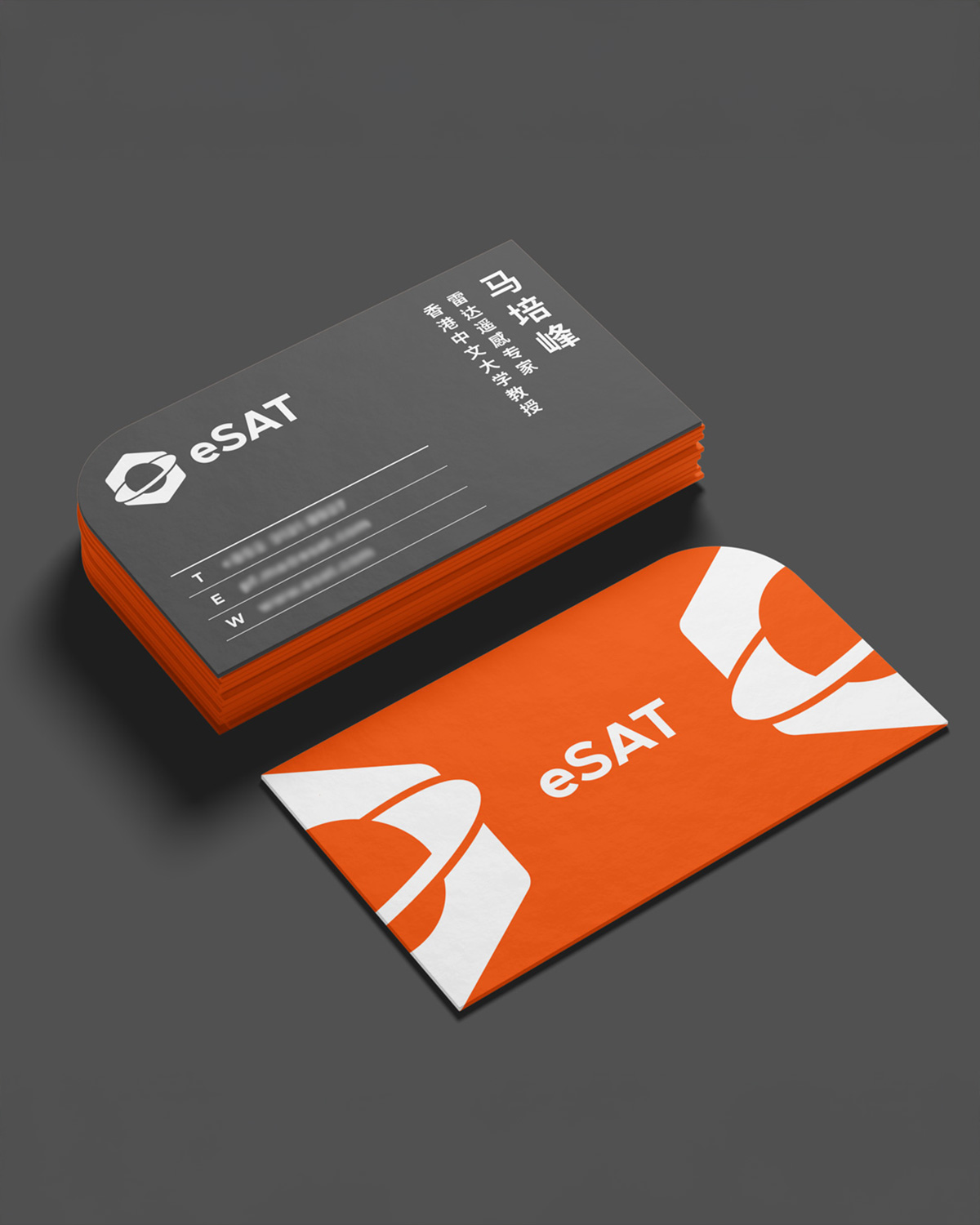
卡片正面由左右兩個 Logo 合拼成一扇敞開的大門,象徵 eSAT 引領社會邁向創新科技的新時代。
On the front of the name card, the two logo combine to create an open gateway, symbolizing eSAT’s role in leading society into a new era of technological innovation.
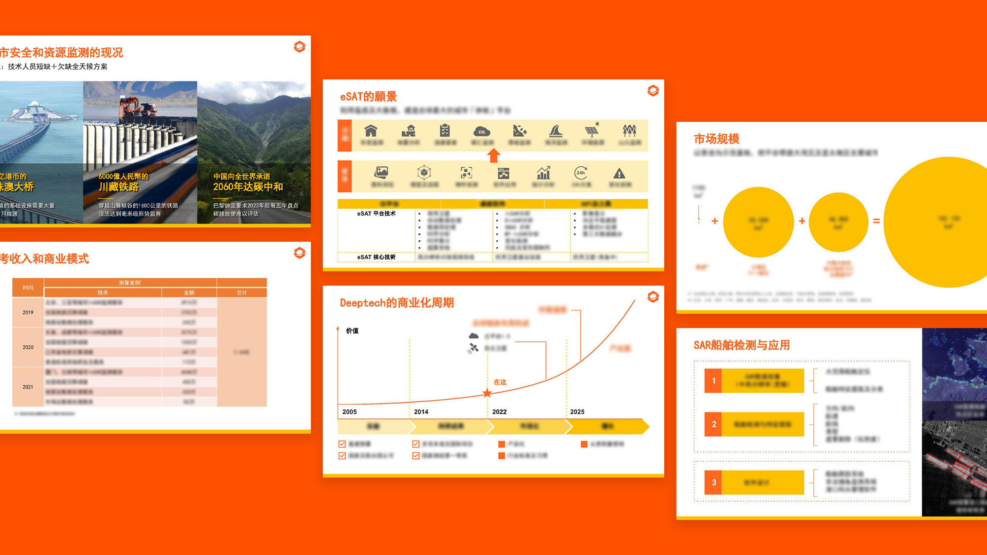
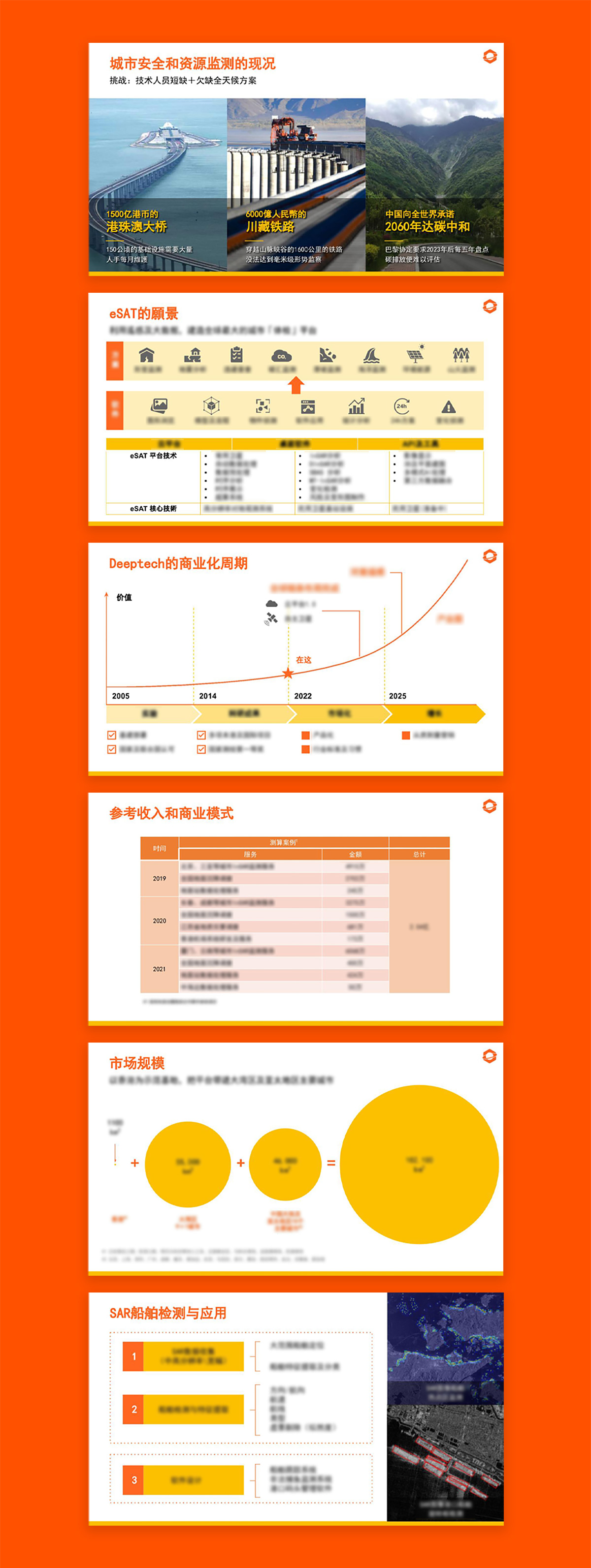
我們以 Infographic 的形式,配合橙色和黃色的品牌顏色,把投資簡報的複雜資訊料整理成更易於閱讀的內容。
We utilize infographics in the investment deck, incorporating the orange and yellow brand colors to simplify complex information and present it in a more accessible way.
我們以 Infographic 的形式,配合橙色和黃色的品牌顏色,把投資簡報的複雜資訊料整理成更易於閱讀的內容。
We utilize infographics in the investment deck, incorporating the orange and yellow brand colors to simplify complex information and present it in a more accessible way.