Ailuro
簡介 Introduction
設計問題 Problems
Ailuro 針對電子遊戲文本,包括故事內容、系統提示與技能說明,提供高品質 AI 翻譯服務,並支援多國語言。作為新創公司,Ailuro 品牌辨識度有限且產品功能複雜,因此需要透過設計,展現品牌及產品特色。
Ailuro delivered high-quality AI translation services for digital game content, including storylines, system prompts, and skill descriptions, with support for multiple languages. As an emerging startup, Ailuro faced limited brand recognition and a complex product offering. The company, therefore, needed strategic visual branding to articulate its identity and communicate its product value.
解決方案 Solutions
方法 Methods
研究 Research
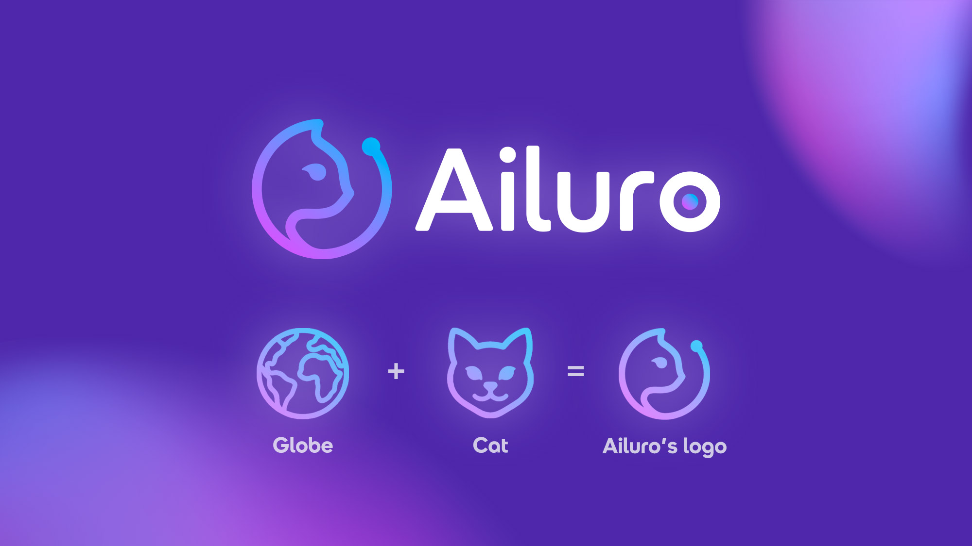
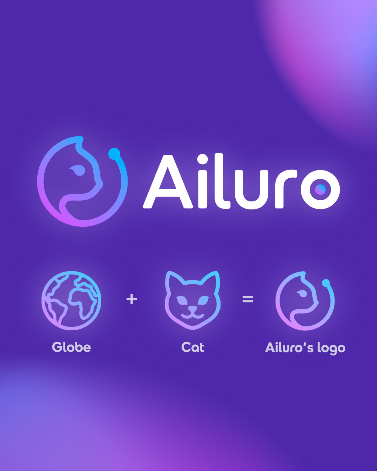
Ailuro 的名稱源自希臘文「貓」,而「CAT」同時代表 Computer Assisted Translation,因此品牌名稱兼具 AI 與翻譯的含義。我們將 AI 與貓的概念融入品牌識別,並延伸至小冊子的設計。
The name Ailuro is derived from the Greek word for “cat”, while “CAT” stands for Computer Assisted Translation; hence, the brand name embodies both AI and translation. We integrate the concept of AI and cat into the brand identity, extending it to the design of the leaflet.


藝術指導 Art Direction
簡介 Introduction
簡介 Introduction
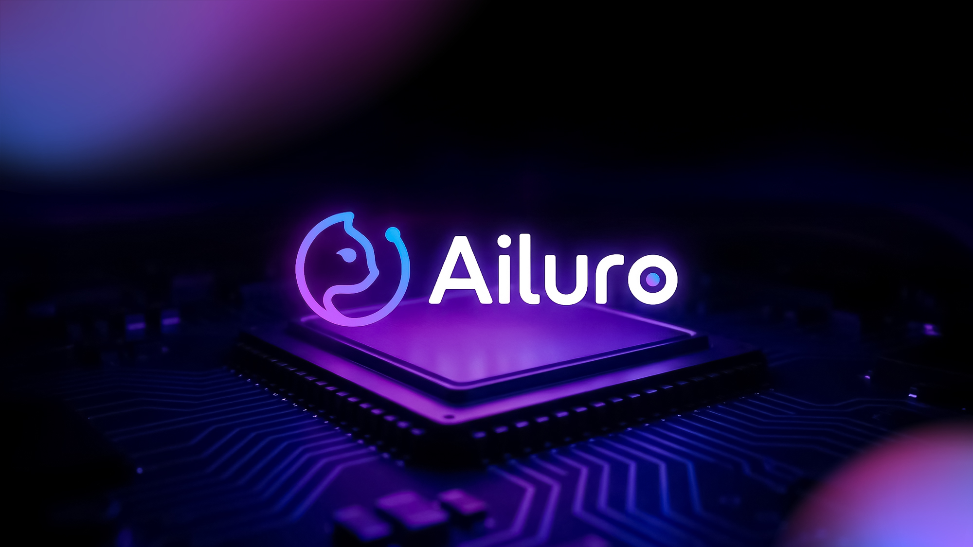
Ailuro 的業務以數碼平台為核心,因此我們選用了螢光藍紫漸層作為主色。高對比又富有動感的配色,能在螢幕上脫穎而出,並提高辨識度。搭配 KIDS Display 圓潤簡潔的無襯線字體,既增添現代氣息,又為品質形象注入親和力。
Ailuro’s business is rooted in digital platforms, which is why we choose a neon blue-purple gradient as the primary brand color. The high-contrast, dynamic palette stands out on screens and strengthens visual recognition. The rounded and minimalist KIDS Display sans-serif typeface adds a modern touch while infusing the brand image with approachability.
成品 Results
結果 Results
Logo 將貓的輪廓與地球的圓形結合,象徵品牌以貓般的敏捷與靈活,推動全球語言翻譯,跨越溝通的界限。字母「o」中的圓點,不僅代表 AI 的智慧核心,也呼應貓眼的銳利洞察,寓意 Ailuro 的翻譯精準細膩。
The logo combines the silhouette of a cat with the circular form of the globe, symbolizing a cat’s agility and flexibility in driving global language translation and breaking communication barriers. The dot within the letter “o” represents both the intelligent core of AI and the keen gaze of a cat’s eye, signifying Ailuro’s precision and subtlety in translation.

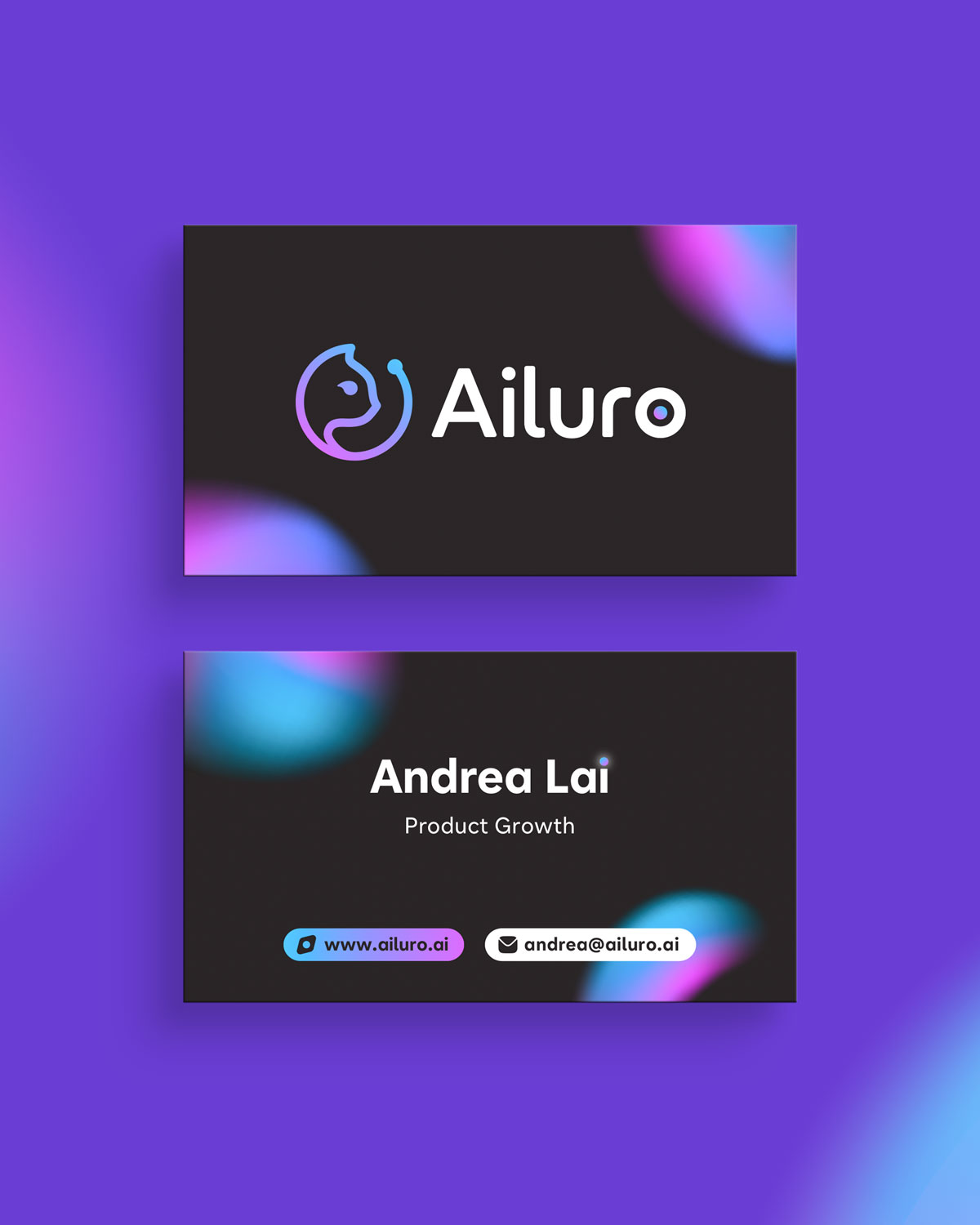
名片設計以螢光藍紫漸層配搭純黑背景。名字中「i」字母上的圓點以懸浮的光暈呈現,散發出科技感與未來感。
The name card design pairs a neon blue-purple gradient with a pure black background. The dot above the letter “i” is rendered as a hovering glow, adding a sense of technology and futurism.
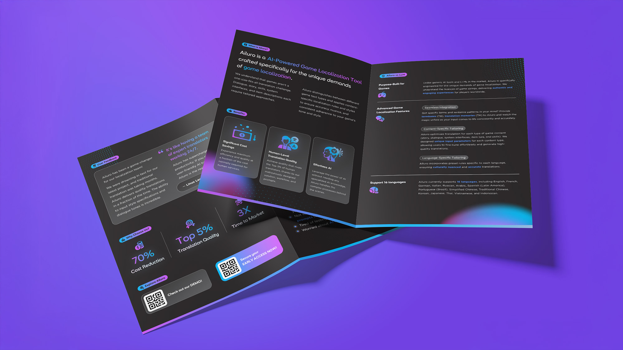
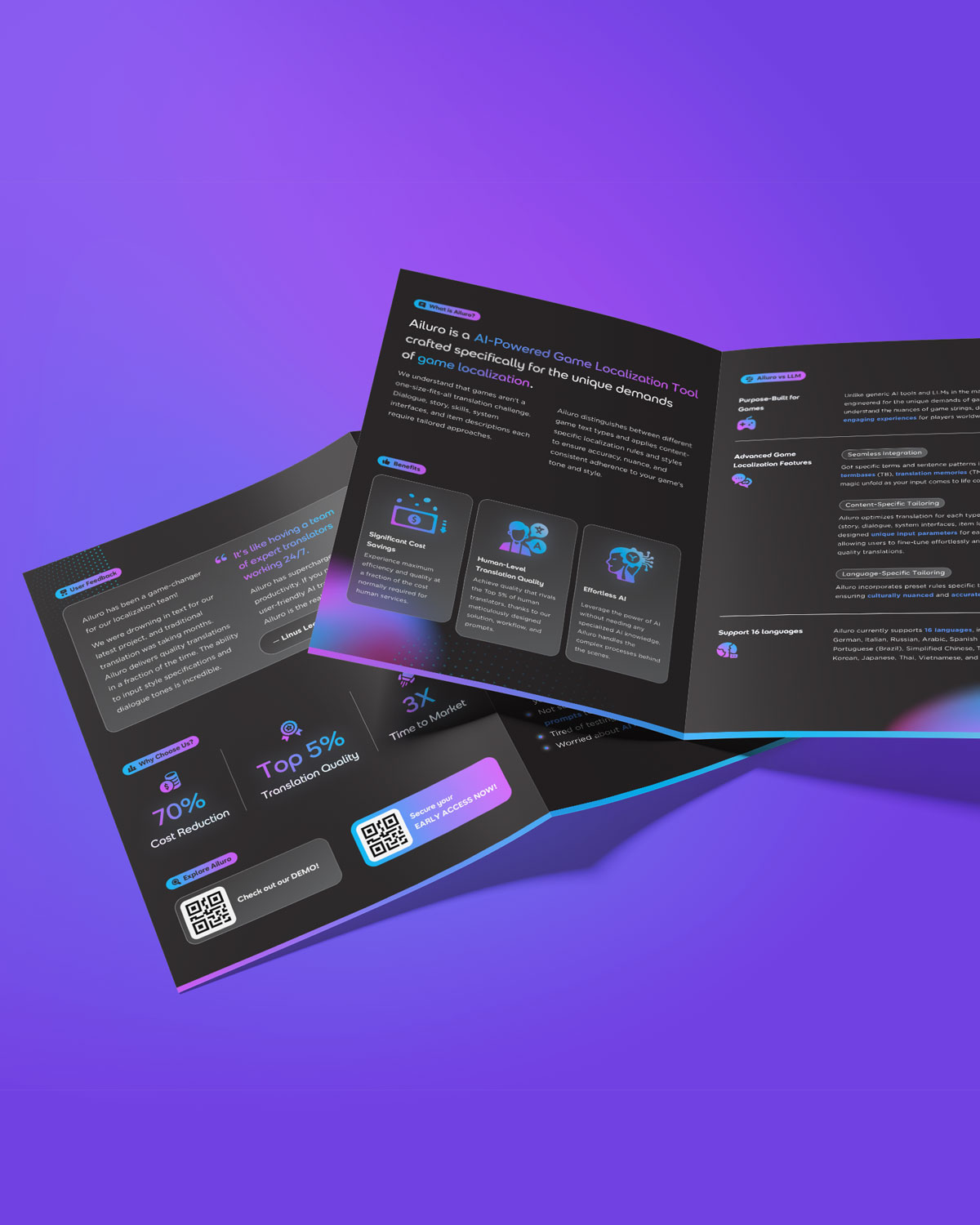
我們亦為 Ailuro 設計了 A5 小冊子,將原本文字密集的建議書轉化為清晰、易讀的版面,突顯關鍵資訊,提升可讀性。
We also designed an A5 leaflet for Ailuro, transforming a text-heavy proposal into a clear, easy-to-read layout that highlights key information and enhances readability.